


Welcome to a kaleidoscopic journey where we unveil the secrets of hues that don’t just paint your world but also keep you glowing through the years! From timeless tones to bold, youthful shades, we’ll explore how colors can refresh your look and add a dash of pizzazz to your personal style. Whether you’re ready to embrace a fiery red or a serene pastel, these tips will have you looking as radiant as you feel. Let’s dive in—because life’s too short for boring colors!
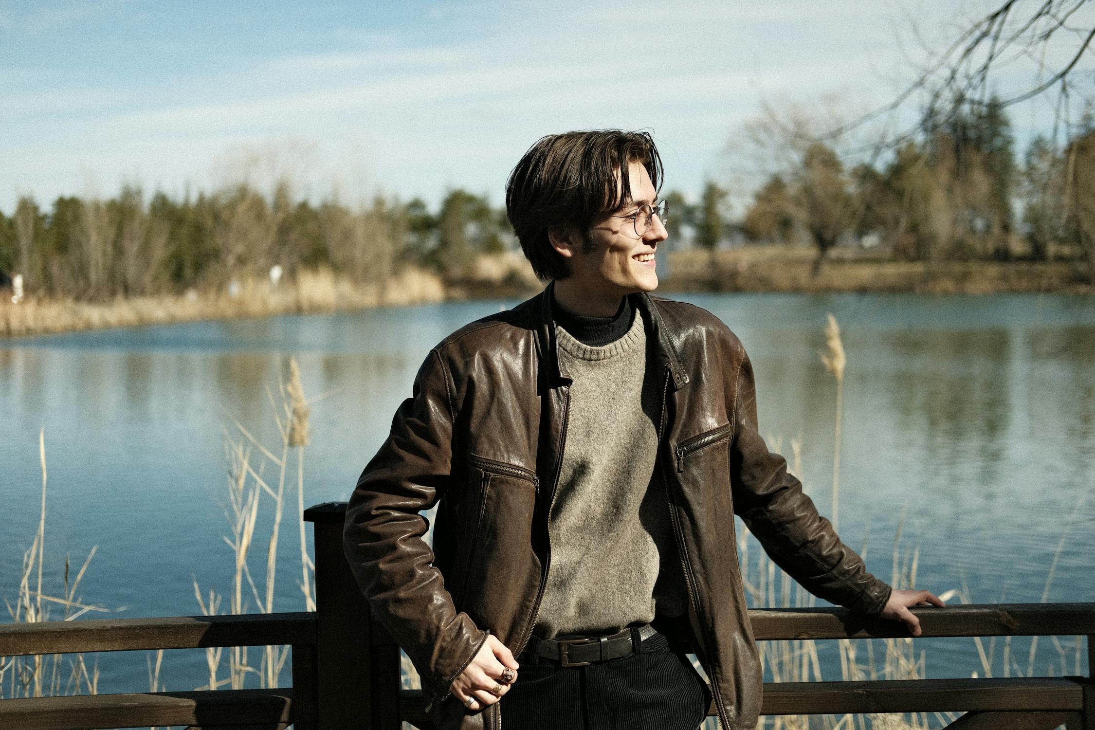
Dark Brown: Timeless Sophistication or Dated Style?
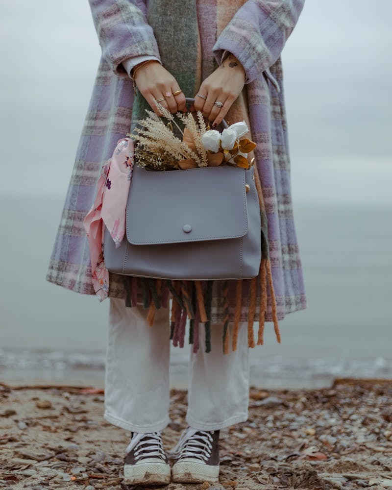
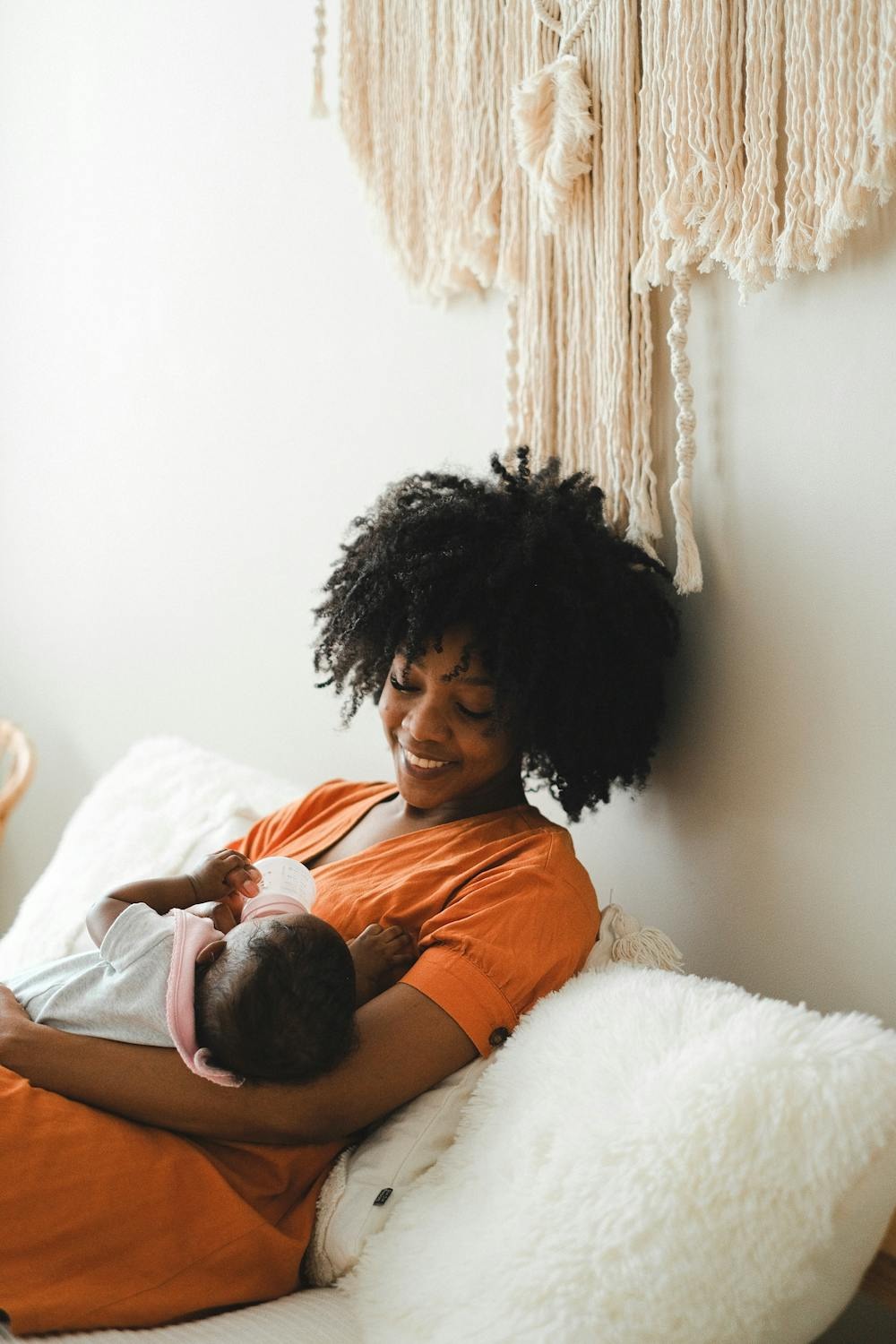
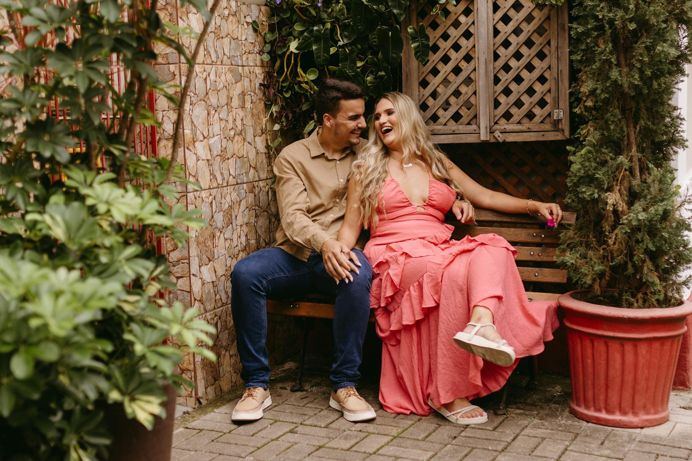
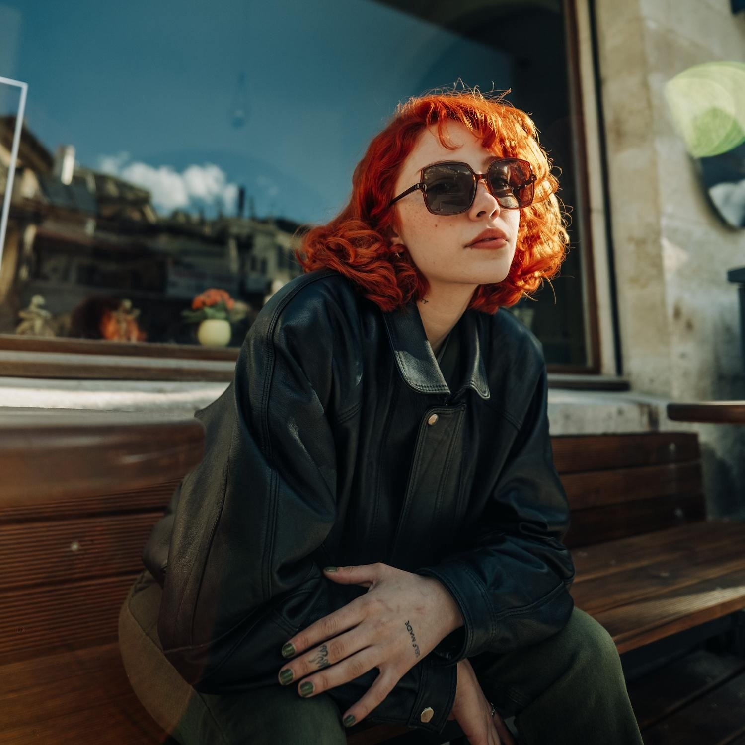
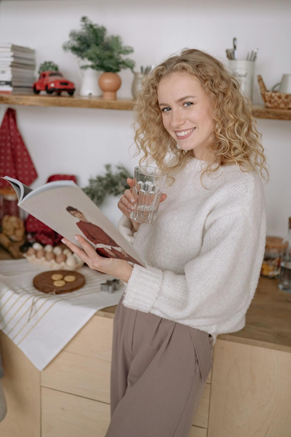
Source: pexels
Dark brown is a go-to for a polished, refined look, but use it wisely. The wrong shade or overuse can drift into dull territory, risking an outdated vibe instead of elegance. Pairing it with lighter, fresher hues can create a balanced and modern aesthetic. Style this classic thoughtfully to keep its sophistication intact while avoiding an aged appearance.
Navy Blue: From Timeless Classic to Too Stuffy
Navy blue is a timeless classic, exuding professionalism and sophistication. However, without a modern touch or playful accessories, it can lean toward a conservative, aging effect. Adding vibrant accents or trendy elements can breathe life into this shade, transforming it into a versatile option that showcases your energy and style instead of weighing you down.

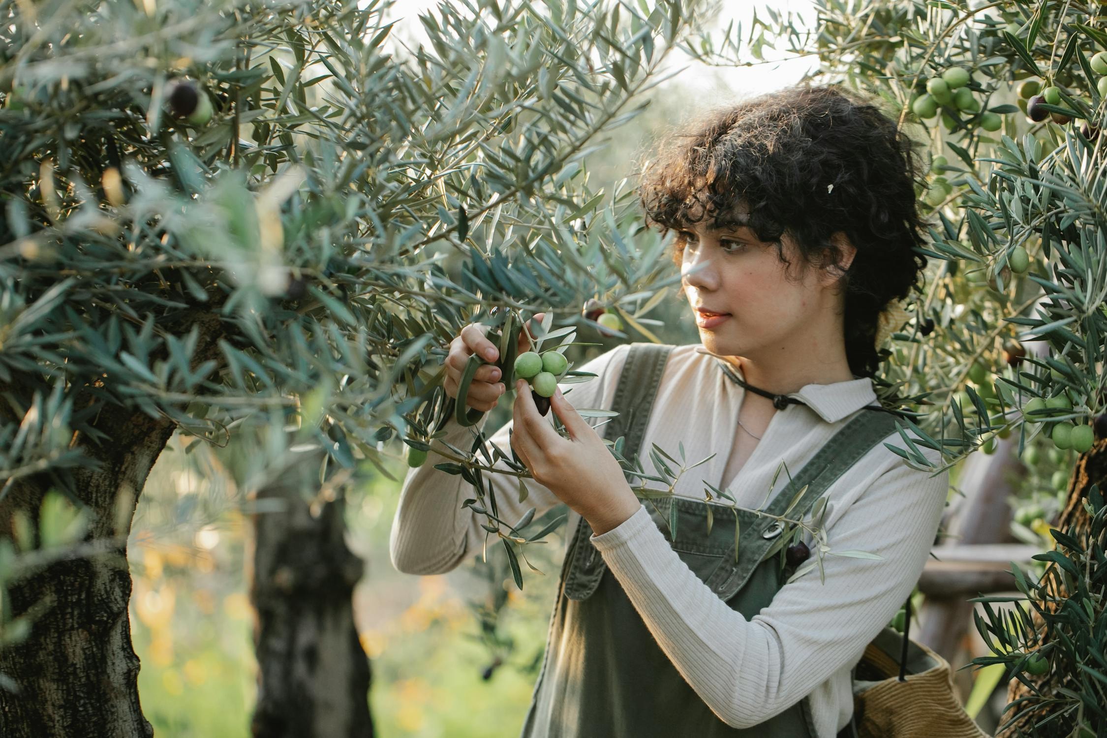
Olive Green: Military Chic or Outdated?
Olive green exudes a rugged charm that shines in the right setting. Yet, its earthy undertones can occasionally feel outdated, particularly when combined with other muted shades. To keep this color looking fresh, pair it with bold hues or modern patterns. This approach preserves its distinctive appeal while adding a youthful, contemporary edge.
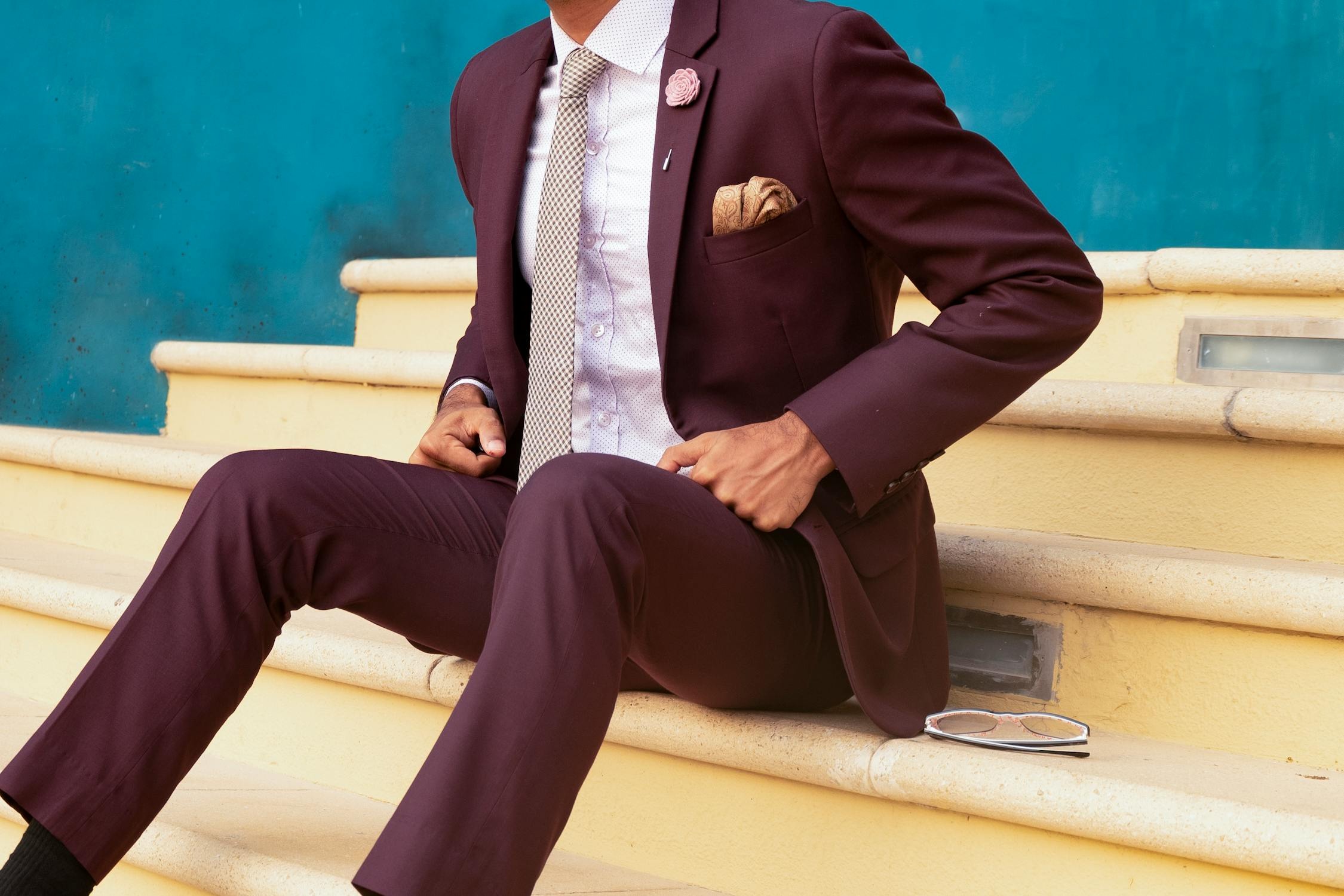
Maroon: Red’s Mature Cousin
Maroon, the richer and deeper shade of red, radiates warmth and wisdom. However, it walks a delicate line between elegance and appearing overly mature. To avoid an aged effect, use maroon sparingly or pair it with lighter, uplifting tones. This approach lets you embrace its depth and richness while keeping your look fresh and contemporary.
Charcoal Gray: Sophisticated or Stale?
Charcoal gray is often seen as elegant and reliable, favored for its refined maturity. However, leaning too heavily on this shade can risk a dull, aging effect. Adding vibrant accents or textured layers can inject energy and style into your look. This way, you retain its sophisticated charm without letting it age your appearance.
Mustard Yellow: Stylish or Overwhelming?
Mustard yellow has become a bold fashion favorite, but it doesn’t always work in your favor. This vibrant shade can sometimes add an unflattering maturity or cast shadows on your complexion, aging your appearance. Opting for softer yellows or using mustard as an accent rather than a main feature can strike the perfect balance, keeping your look fresh and glowing.

Muted Pastels: Softly Chic or Faded Away?
Muted pastels are loved for their delicate charm, but they can sometimes wash out your features if not styled thoughtfully. These subtle hues might create a pale, aging effect, particularly on lighter skin tones. To avoid this, pair muted pastels with richer, contrasting colors or add vibrant accessories to bring depth and energy, ensuring a fresh and dynamic look.
Wine Red: Sophisticated or Draining?
Long associated with elegance, wine red can sometimes verge on making you look fatigued or drawn. Its deep tones may emphasize dark shadows and fine lines. To counter this, pair wine red with lighter shades or contrasting textures to add brightness and vitality, ensuring it enhances your vibrancy rather than aging your appearance.
Dusky Pink: Timelessly Romantic or Dated?
Dusky pink, long celebrated for its romantic allure, can occasionally feel nostalgic or outdated. Its muted tone might soften your natural glow, unintentionally adding years to your look. To keep it fresh, pair dusky pink with vibrant colors or bold patterns, blending its vintage charm with a modern, youthful flair that’s both captivating and energizing.
Taupe: Versatile or Forgettable?
Taupe is prized for its versatility, but its neutrality can sometimes fade into the background, diminishing your features and adding an unintended touch of age. Worn monochromatically, this subtle shade might drain vibrancy from your look. To keep taupe lively, pair it with bold colors or standout accessories that add character and prevent it from feeling too plain.
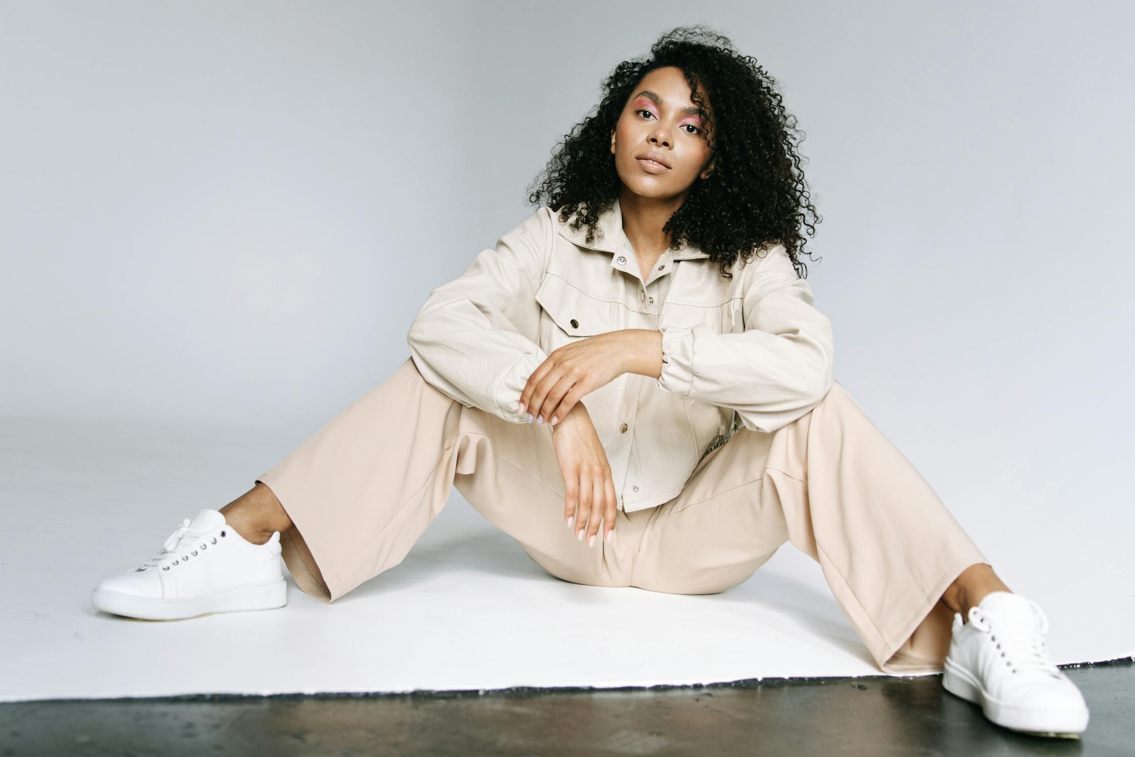
Beige Clothing: A Timeless Classic or a Senior Staple?
Beige brings a sense of neutrality and warmth, but it can sometimes feel dull, potentially adding an aged impression. Often linked with more traditional styles, it may lack the energy needed for a youthful wardrobe. To refresh your look, opt for lighter, more radiant shades that enhance your skin tone and infuse vibrancy into your appearance.

Smoky Gray: Boldly Chic or Fading Away?
Smoky gray exudes sophistication, but it can sometimes dull your look, adding an unintended sense of age. Without the right accents, this shade might overshadow your vibrancy, leaving you looking tired. To maintain a youthful energy, pair smoky gray with brighter hues that balance its muted tone and add a refreshing touch to your style.

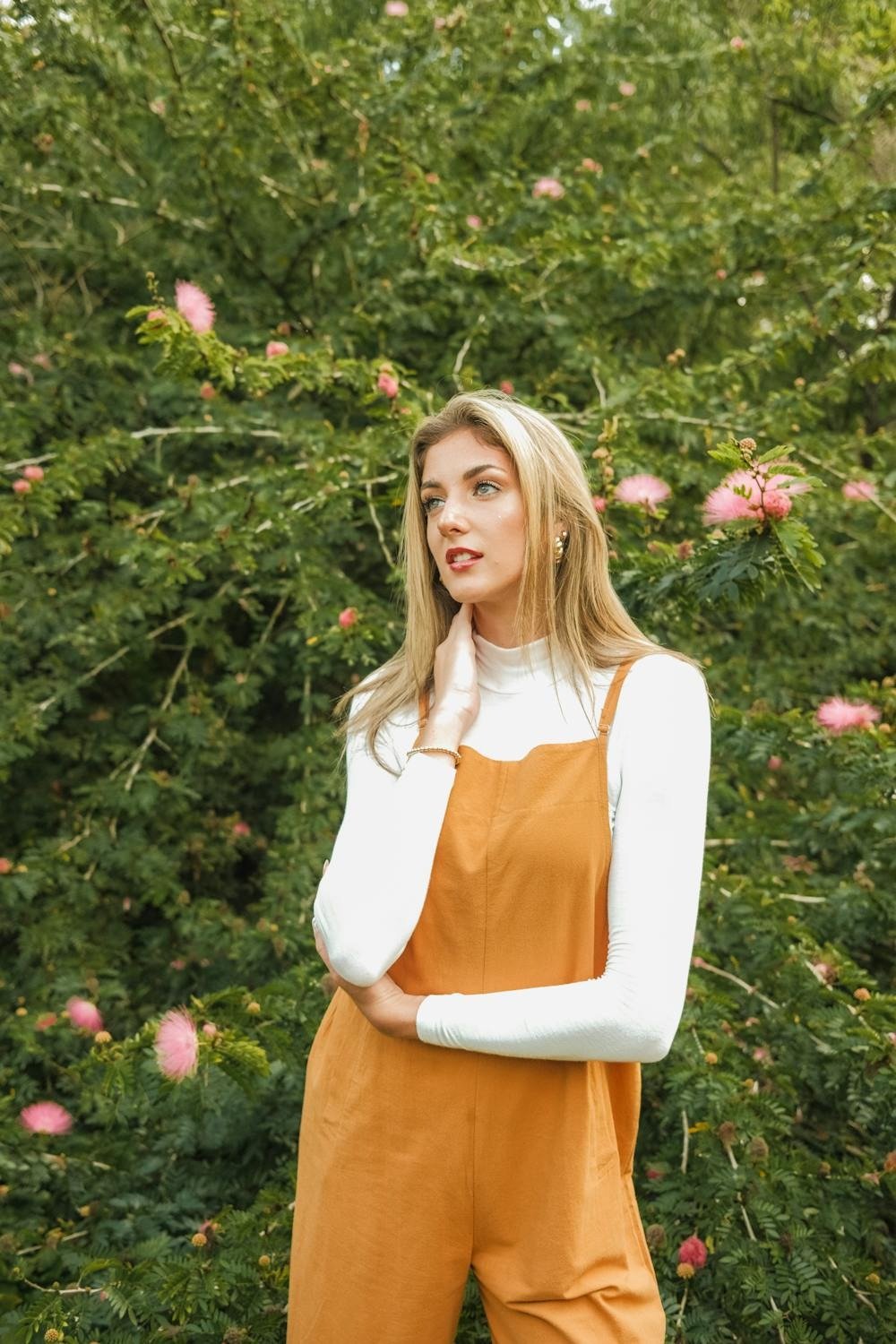
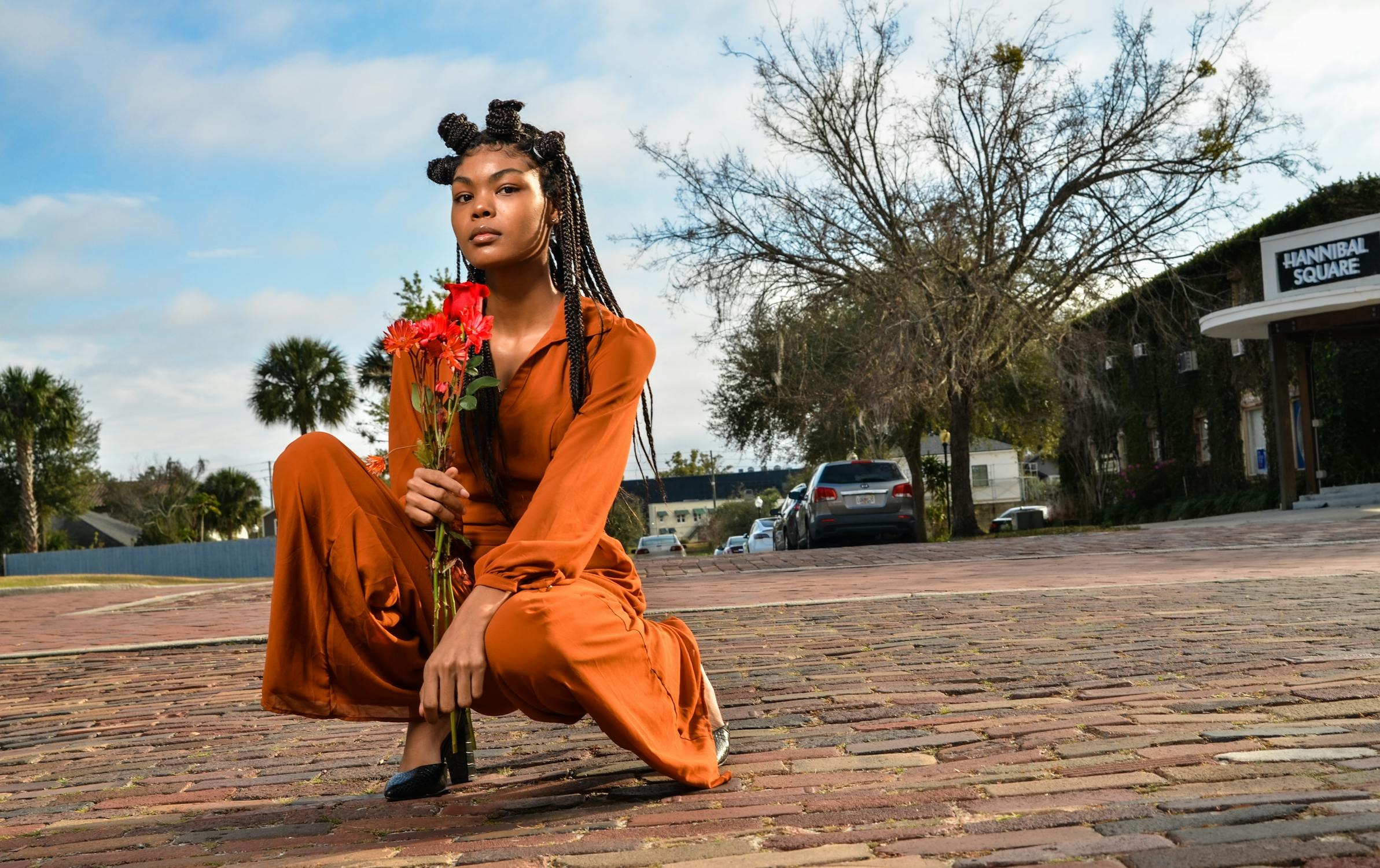
Burnt Orange: Seasonal Charm or Dated Choice?
Burnt orange, with its rich earthy tones, radiates warmth and coziness. However, it can occasionally feel dated, diminishing your youthful vibrancy. Overusing this autumnal shade might overwhelm and add an aged appearance. To keep it fresh, incorporate burnt orange in small, strategic accents and pair it with lighter, brighter tones for a balanced, rejuvenating look.
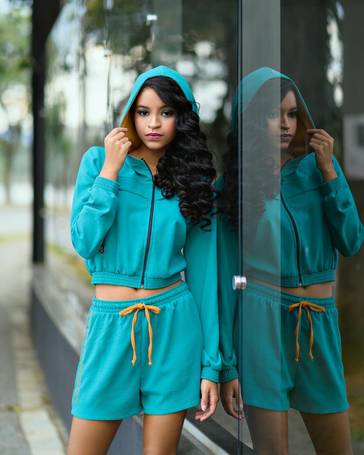
Teal: Vibrant or Vintage?
Teal carries a rich, bold legacy but can occasionally feel dated when worn on its own. While striking, it may anchor your look to bygone trends. To keep teal fresh and modern, pair it with contemporary fabrics and silhouettes or combine it with trendy patterns that reflect today’s fashion sensibilities.
Forest Green: Grounded or Distant?
Forest green offers a grounded, timeless appeal but can occasionally feel dated when overused. Its deep tones may cast shadows that lend an older appearance. To keep this shade fresh, pair it with neutral or pastel accents to soften its depth, or opt for accessories that bring out lighter, more dynamic elements in your ensemble.
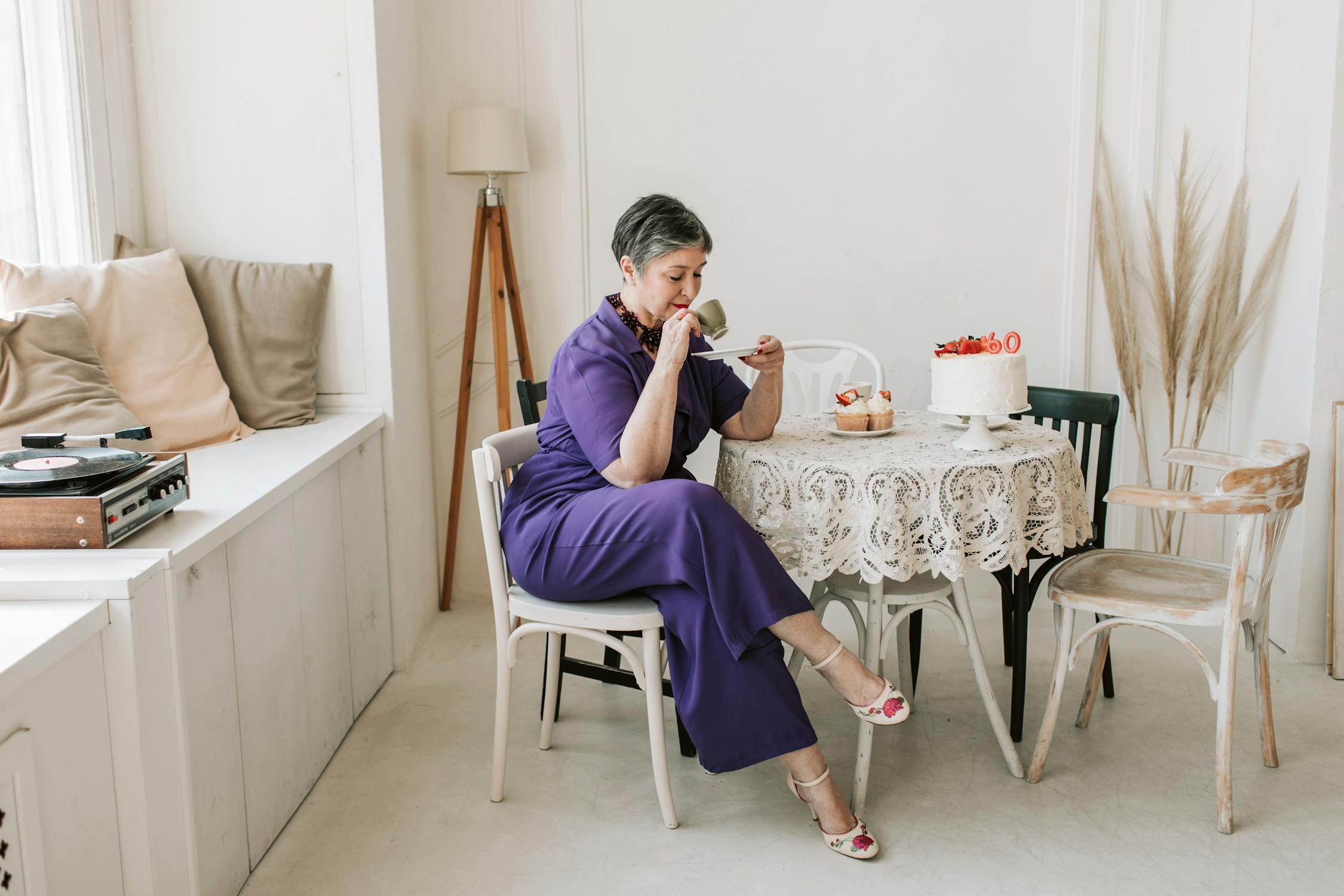
Deep Purple: Majestic or Outdated?
Purple exudes luxury and sophistication, but it can unintentionally add years if not styled carefully. While its regal allure is undeniable, deeper shades can create a heaviness that highlights age lines and dulls your complexion. To keep your look fresh, embrace lighter lilacs or subtle tones that enhance your natural glow and preserve a youthful vibrancy.
Coffee Brown: Cozy or Drained?
Brown is a timeless and grounding color, but darker coffee tones can sometimes overpower your look. Instead of adding warmth, they may create shadows that dull your complexion. Opt for lighter, earthy shades that maintain a grounded vibe while keeping your appearance fresh and vibrant, avoiding the heavy undertones that can subtly age you.

Oatmeal Shades: Cozy or Uninspired?
Oatmeal tones offer a cozy, neutral appeal, but without careful styling, they can veer into blandness. These soft hues may lack the vibrancy needed to enhance your complexion, potentially adding an aged effect. Incorporate rich textures or bold accessories to bring life to your look and steer clear of a washed-out, overly subdued aesthetic.
Indigo: Luxurious or Heavy?
Indigo is a captivating choice, blending serenity with charisma. Yet, its deep, moody tones can sometimes emphasize shadows and tired features. To keep indigo feeling vibrant and sophisticated, pair it with bright accents that balance its richness. This ensures its inherent glamour shines without veering into a somber aesthetic.

Burgundy: Timeless Sophistication
Burgundy carries an air of refined elegance, but excessive use can unintentionally highlight an aged look. This rich wine hue may overpower the vibrancy of your style. Instead, use burgundy sparingly to infuse sophistication while avoiding a heavy, aging effect. Pair it with lighter or neutral tones for a harmonious and youthful balance.
Sage Green: Natural or Nostalgic?
Sage green is celebrated for its soothing, nature-inspired charm, but in wardrobe choices, it can sometimes have an unintended impact. While it creates a calming atmosphere in design, when worn, it may dull your complexion and risk appearing dated. Rather than offering a fresh, vibrant look, sage green can subtly enhance an aged aesthetic.
Moss Green: Turn Back Time
Moss green evokes images of tranquil forests and natural beauty, but as a clothing choice, it may not always deliver a youthful glow. Its deep tones can sometimes cast a dull undertone on your complexion, subtly aging your appearance. Instead, opt for brighter, livelier greens to maintain a fresh and vibrant look.
Blush Pink: Charming or Overdone?
Blush pink is often praised for its soft, romantic charm, but it doesn’t always flatter as a wardrobe choice. While it can lend a sweet and delicate touch, the wrong shade or excessive use might wash you out, subtly aging your appearance. Opt for carefully chosen tones and pairings that complement your complexion, ensuring the color enhances rather than overwhelms your look.
Sepia Tones: Timeless or Tired?
Sepia tones, celebrated for their nostalgic and historic charm, may fall short in fashion. While ideal for vintage photo aesthetics, these hues can unintentionally overshadow your modern vibrancy, adding a sense of weary sophistication that leans more toward aging than elegance. Pair sepia with fresh, lively colors to create a balanced and revitalized look.
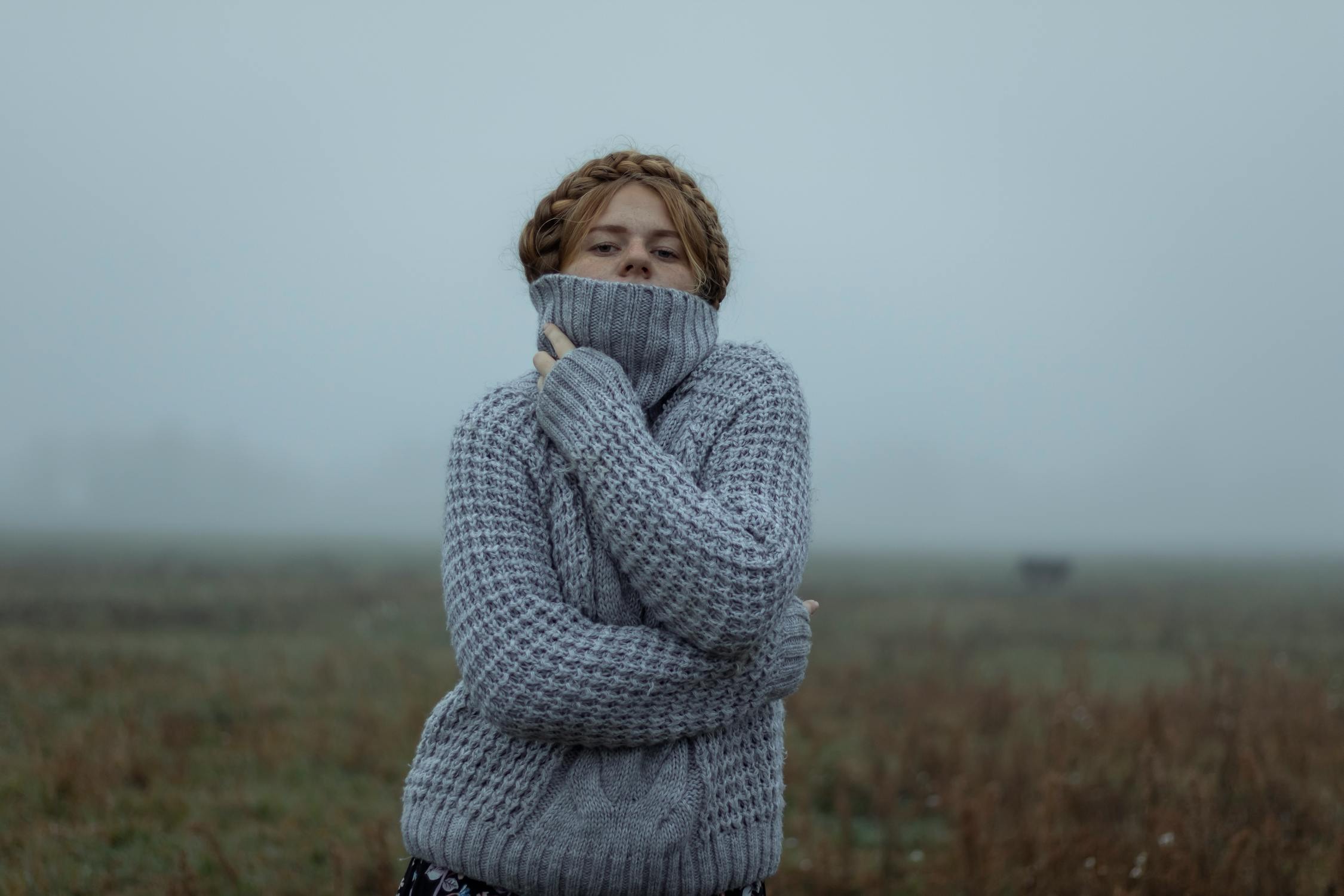
Pebble Gray: Classic but Aging?
Pebble gray, a versatile neutral and wardrobe staple, can sometimes fall short in adding vitality to your look. Its subtle tone may appear flat, leaving you looking washed out or older rather than enhancing your ensemble. To keep your style fresh, consider richer gray tones or incorporate contrasting colors for a boost of youthful energy.
Desert Sand: Classic or Draining?
The soft, earthy hue of desert sand evokes sunlit landscapes, but it can sometimes dull your youthful glow. Its muted tone may lack the vibrancy to complement skin tones, potentially washing out your natural radiance. To keep your look fresh and lively, pair desert sand with brighter or contrasting shades for a more dynamic effect.
Graphite: Striking or Severe?
Graphite exudes undeniable sophistication and sleekness, but its heavy tone can sometimes add an unintended seriousness that ages your look. To avoid this, pair it with metallic accents or vibrant colors to lighten its intensity and bring a touch of energy and modernity to your ensemble.
Aubergine: Captivating or Dated?
Aubergine’s deep, rich tones exude elegance, but its somber nature can sometimes age your appearance. To prevent its maturity from overshadowing your look, pair it with vibrant hues or playful prints. This combination balances its classic appeal with a modern twist, allowing it to enhance rather than overpower your youthful vibe.
Ash Gray: Fading the Freshness
Ash gray, a minimalist wardrobe favorite, can sometimes dim your natural radiance. Its subtle tone may create an overly muted look. To maintain a youthful edge, elevate ash gray with bold accessories or vibrant pops of color that add energy and refresh your overall appearance.
Nutmeg: A Spice That Doesn’t Always Entice
Nutmeg brings a cozy warmth but can unintentionally age your look if it doesn’t harmonize with your skin’s undertones. This earthy shade requires thoughtful pairing to avoid appearing dated. To keep it fresh, combine nutmeg with complementary colors that flatter your complexion and add a vibrant touch to your style.

Dusty Blue: Faded Denim Vibes
Denim is a timeless classic, but dusty blue tones can sometimes age your appearance. This muted shade may sap the vibrancy from your complexion, creating a more subdued and older look. Opt for brighter, more vibrant blues to keep your style youthful and energetic. Choosing shades that enhance your natural glow is key to maintaining a fresh and lively presence.

Caramel Tones: Luxurious or Outdated?
Caramel tones evoke the richness of toffee, but when overused, they can feel dated. These warm shades might blend too closely with your skin, creating a washed-out or aging effect. Instead, incorporate caramel through accessories or pair it with brighter, more vibrant hues to add depth and energy. Striking the right balance is essential to keeping your look fresh and timeless.
Chocolate Brown: Rich or Overbearing?
Chocolate brown exudes richness and warmth, but it can sometimes lack the energy needed for a youthful vibe. Its deep tones may overshadow lighter features, subtly adding years to your appearance. To keep your style fresh, pair chocolate brown with brighter or more dynamic shades. Adding vibrant accents can balance its depth and maintain a refined, lively elegance.
Midnight Black: Timeless or Overbearing?
Black is undeniably timeless, but when overdone, it can feel heavy and potentially aging. The deep tones of midnight black may emphasize shadows and fine lines, subtly adding years to your appearance. To preserve its elegance while maintaining a youthful touch, incorporate contrasting colors or varied textures to create balance and keep your look fresh and sophisticated.
Ivory: The Mature White
Ivory, with its softer tone compared to pure white, can sometimes lend an aging effect if overused or styled poorly. Its gentle warmth lacks the sharpness needed to deliver a fresh, vibrant look, potentially making you appear fatigued. To counter this, pair ivory with bold, defined colors to create contrast and energy, ensuring it enhances your outfit without dulling your appearance.
Brass: Striking or Overwhelming?
Brass hues convey power and confidence, but they can sometimes unintentionally add years to your look. Their metallic sheen may highlight skin imperfections, making fine lines and wrinkles more noticeable. Rather than acting as a bold statement, brass could leave you looking more mature than desired. Use this shade thoughtfully when incorporating it into your wardrobe.
Rust: Richly Deep or Aging?
Rust is a warm, earthy shade that adds rich depth to any outfit. However, its dark undertones can sometimes create shadows that highlight signs of aging in your complexion. While this vintage-inspired hue evokes nostalgia, it can also age your appearance. Choosing lighter variations allows you to retain its warmth while keeping your look fresh and youthful.
Chalk White: Refined or Retiring?
Chalk white provides a crisp, clean aesthetic, but it can be harsh on aging skin. Its starkness tends to emphasize imperfections like fine lines and uneven textures. Rather than delivering a timeless look, it may leave you looking pale and fatigued. Pair chalk white with bold accessories or softer tones to counterbalance its intensity and maintain a fresh, vibrant appearance.

Khaki: Timeless or Tired?
Khaki is known for its practicality, but its muted, dusty tones can sometimes age the wearer. Lacking vibrancy, it may create a dull, lifeless effect that diminishes a fresh and modern appearance. To keep khaki looking current, use it sparingly or pair it within a color-blocked outfit for a balanced and revitalized style.
Sandstone: Grounded or Aging?
The earthy tones of sandstone exude a grounded appeal but can unintentionally age your appearance. Its muted, neutral shade might make youthful skin seem dull and lifeless. To maintain its charm without sacrificing vibrancy, use sandstone selectively in accessories or footwear. Pair it with brighter colors to add a refreshing contrast and keep your look lively.

Please SHARE this with your friends and family.
